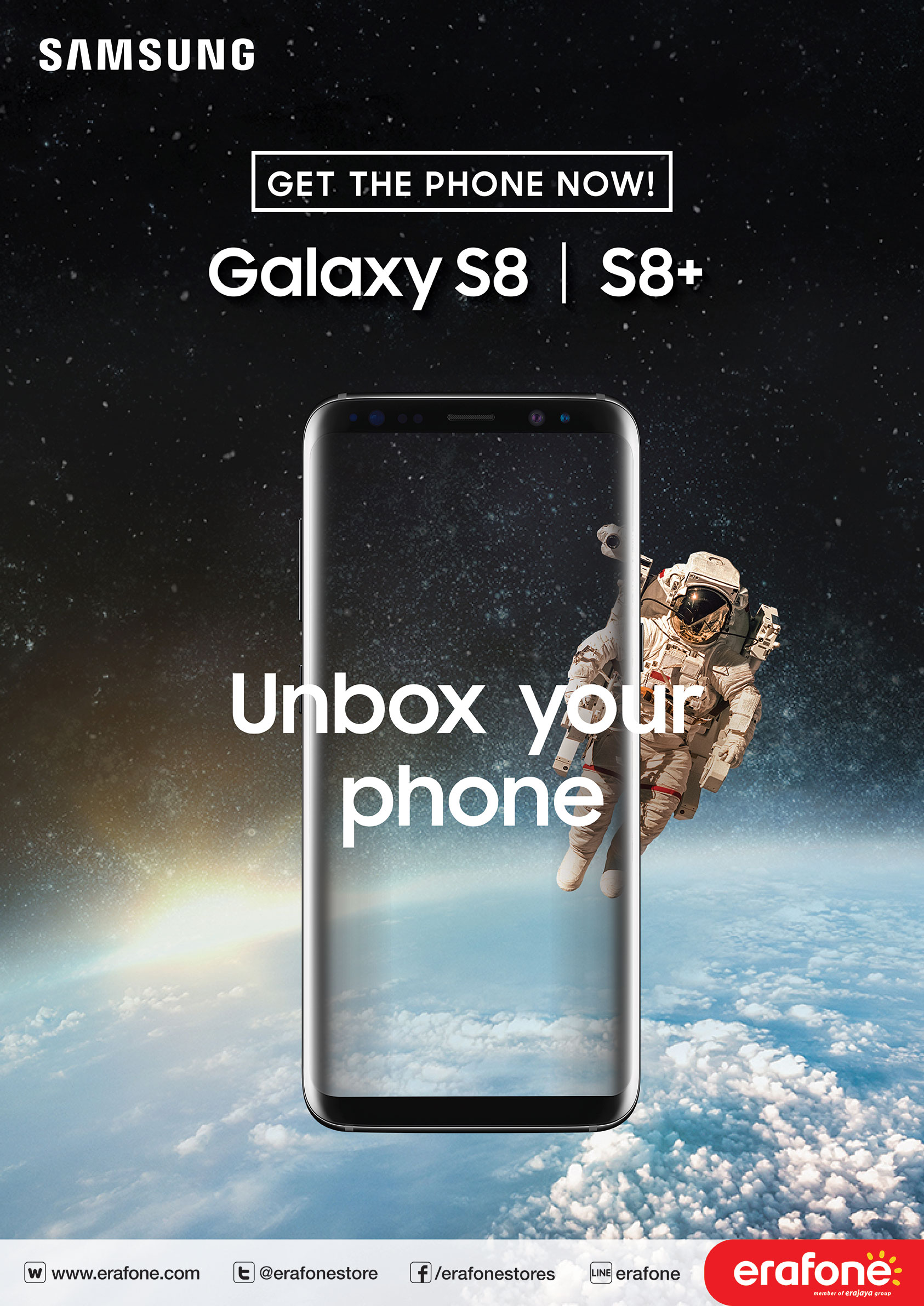


Samsung is actually a word made of two parts - Sam and Sung, and each of them has a meaning. Sam stands for ‘three’ and Sung means ‘stars’, so combined together Samsung literally translates as ‘three stars’ or ‘tristar’. This Korean symbol (‘hanja’) stands to signify something that Samsung is “big, numerous, and powerful” (translated from the ‘sam’ hanja), and ‘eternal’ (as in the ‘sung’ hanja). Summing it all up, we have something big, powerful, and eternal embedded right in Samsung’s DNA, its brand name. It is common for brands to be defined and then become diluted over time. Initially, only a limited amount of collateral is resolved and tested. Brand identity design is often never defined in context to a customer journey or digital user experience, or it excludes day-to-day marketing needs.
Our long-term view was to align the brand guidelines to the new business plan with tailored strategies for each customer segment. Our initial approach was to update and extend the brand guidelines with a new image structure, infographics and operational collateral, building platforms for growth.


The immediate solution was to test and develop an online, print and outdoor customer journey lead generation campaign.
Branding; Printing;
For any question please provide your information below so we can contact you shortly.